What you need to know
- Youtube might be introducing the sleep timer feature that will help users control playback times.
- Users can pick the hours/minutes left until playback stops or even override the sleep time to watch content a bit longer.
- It remains unclear how users will be able to access the feature, assuming it rolls out to everyone.
Looks like YouTube will join other streaming apps to help users control their playback times. This feature is said to stop playback automatically after you’ve fallen asleep.
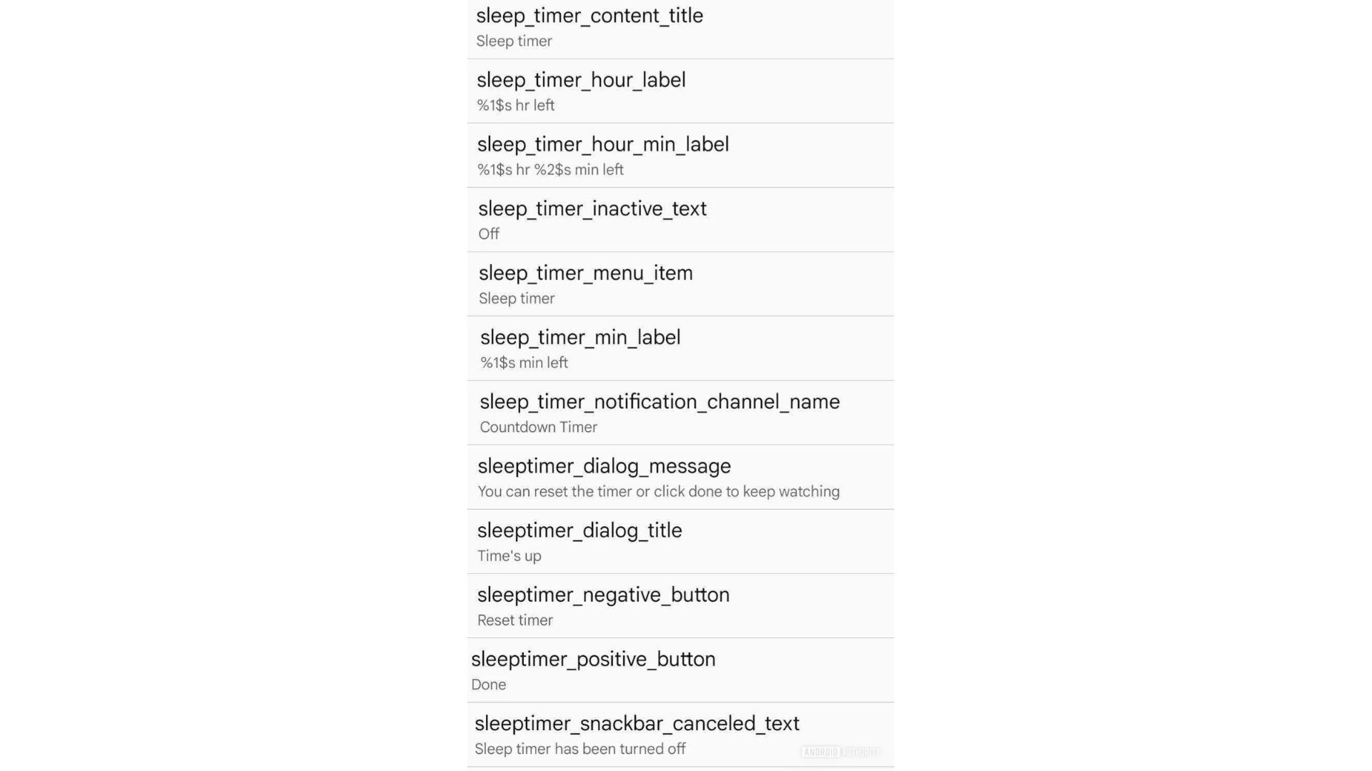
According to Android Authority, Android expert AssembleDebug looked into the beta version 19.25.33 of the YouTube app for Android and found hints of an upcoming timer functionality. The APK teardown into the app showed references to this feature called “sleep_timer_content_title,” it also looks like users can pick the hours and/or minutes left until playback stops.
There’s also “sleep_timer_notification_channel_name” mention, suggesting that the timer could be displayed as a notification for the user.
When AssembleDebug clicked on the option, a dialog box popped up that read, “You can reset the timer or click done to keep watching.” This means the user can override the sleep timer and watch content a bit longer.
This option has been available on the YouTube Music app for a while now and will presumably work the same way on the video app as well. It displays the time left for playback along with a 5-minute timer or canceling it altogether. It’s one of the most useful features already available on many of the best music streaming services, including Spotify.
It remains unclear how users will be able to access the feature, assuming it rolls out to everyone. With Music, users can access the sleep timer option from the three-dot menu on the Now Playing screen.
Like many unreleased features discovered through an APK teardown, we can’t be certain if or when this will be made available for public release. Given that this feature already exists on the Music app, there’s no reason for Google not to introduce it on the video app.
YouTube has been seen making several changes to its app, including a redesign that was spotted earlier this week. YouTube Music’s web version now features a two-column layout for albums and playlists, similar to the Android tablet app. The left column displays album art, release year, detailed descriptions, and handy control buttons. Meanwhile, the right column lists tracks with play counts, durations, and artist details.


